What's yoli?
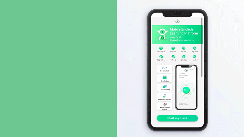
yoli is a revolutionary mobile English-education platform. We connect English learners with tutors, on-demand. yoli aims to revolutionize the language learning market. We are the cutting-edge of the cutting-edge.
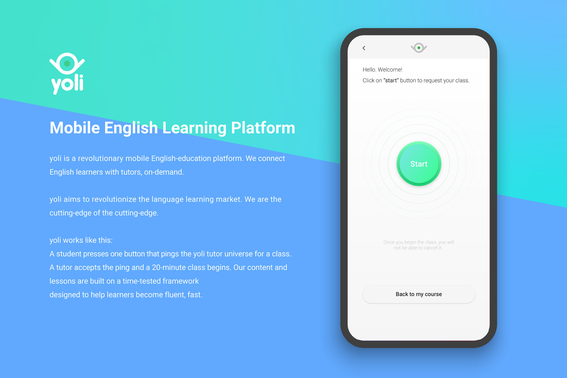
yoli works like this:
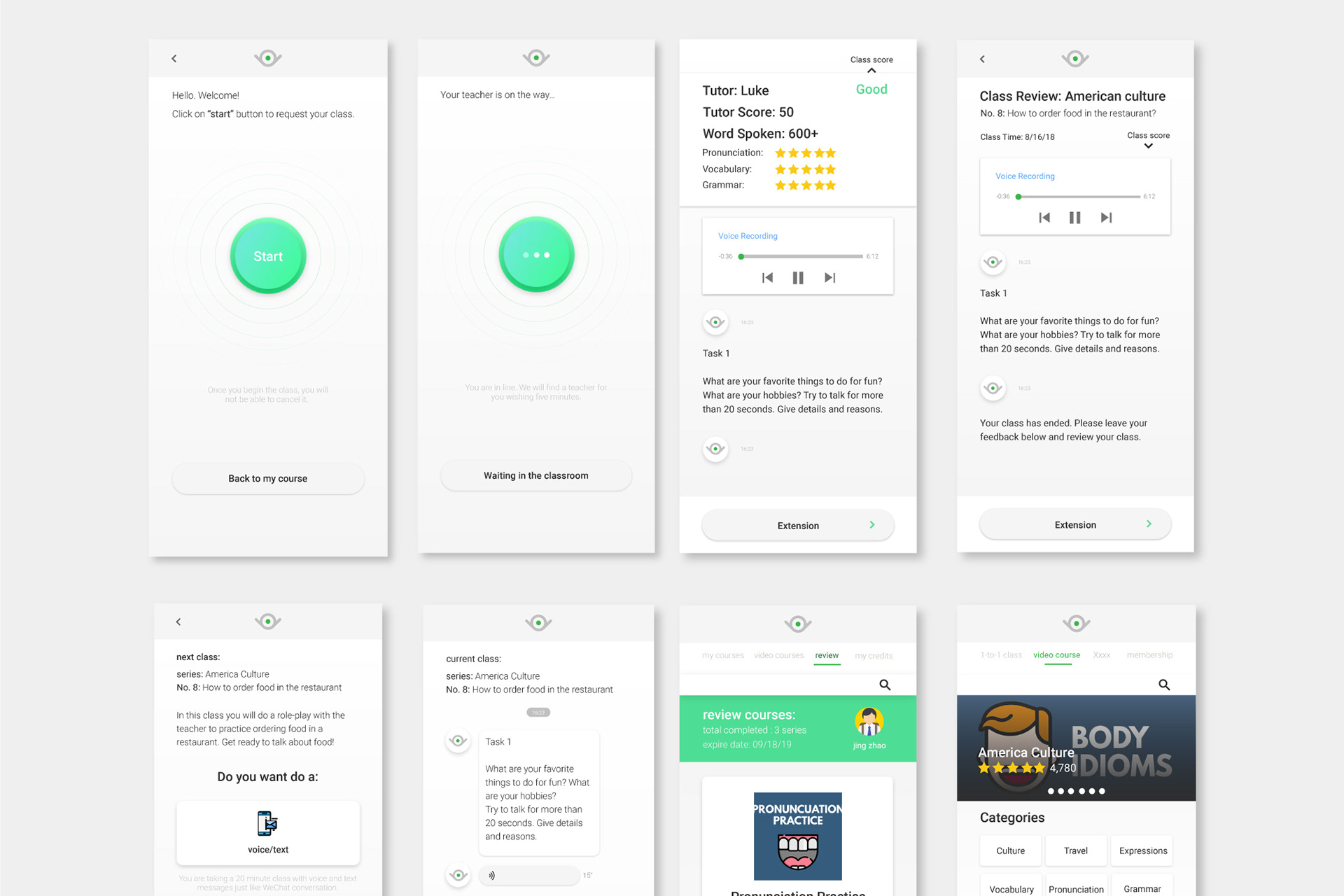
A student presses one button that pings the yoli tutor universe for a class. A tutor accepts the ping and a 20-minute class begins. Our content and lessons are built on a time-tested framework designed to help learners become fluent, fast.
yoli Press:
Kickstarter: yoli: fund your dream lifestyle
3 Cofounders of yoli: https://www.crunchbase.com/organization/yoli#section-overview
Become a yoli tutor: http://tutor.yolichat.com/
RTMASIA: https://www.rtmasia.com/blog/ssyoli
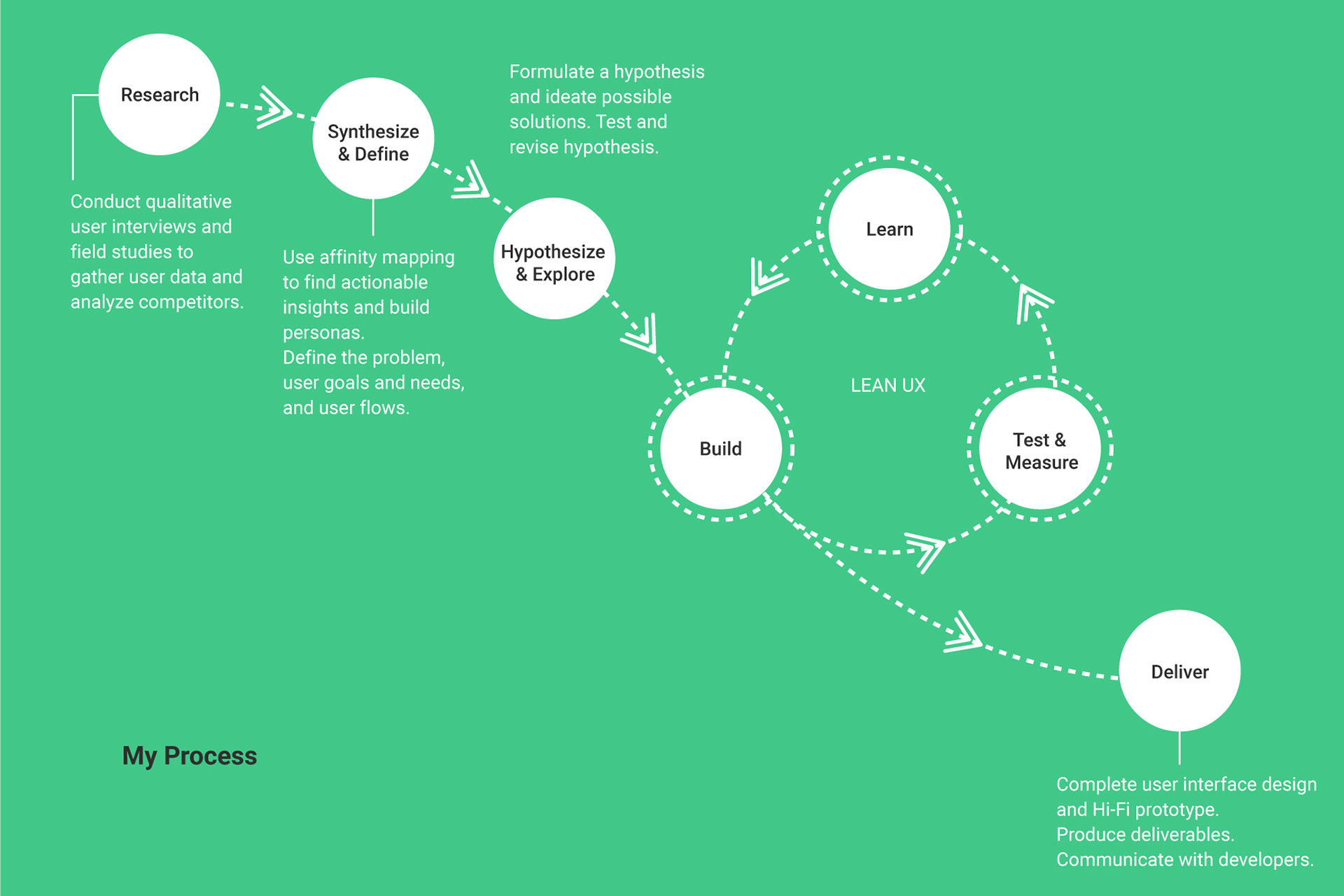
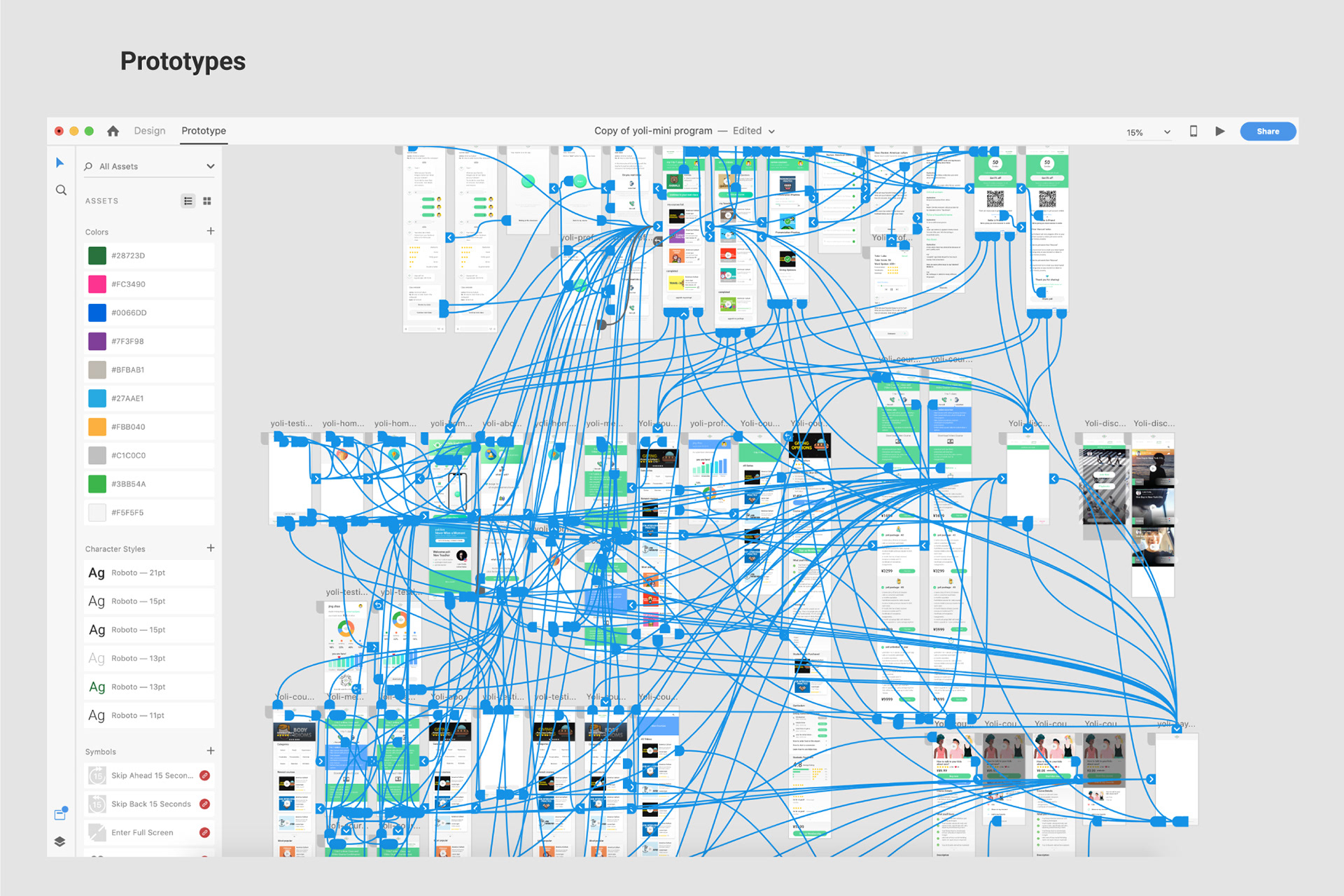
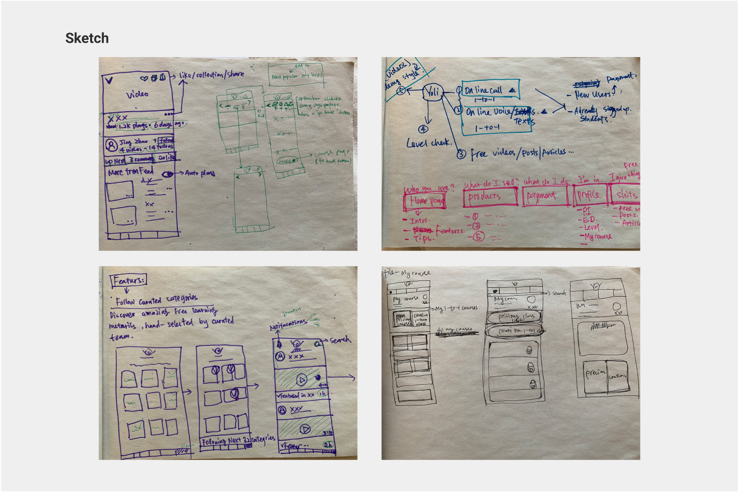
My UX Process
Research - Synthesis & Define - Hypothesis & Explore - LEAN UX (Build + Test & Measure + Learn) - Deliver
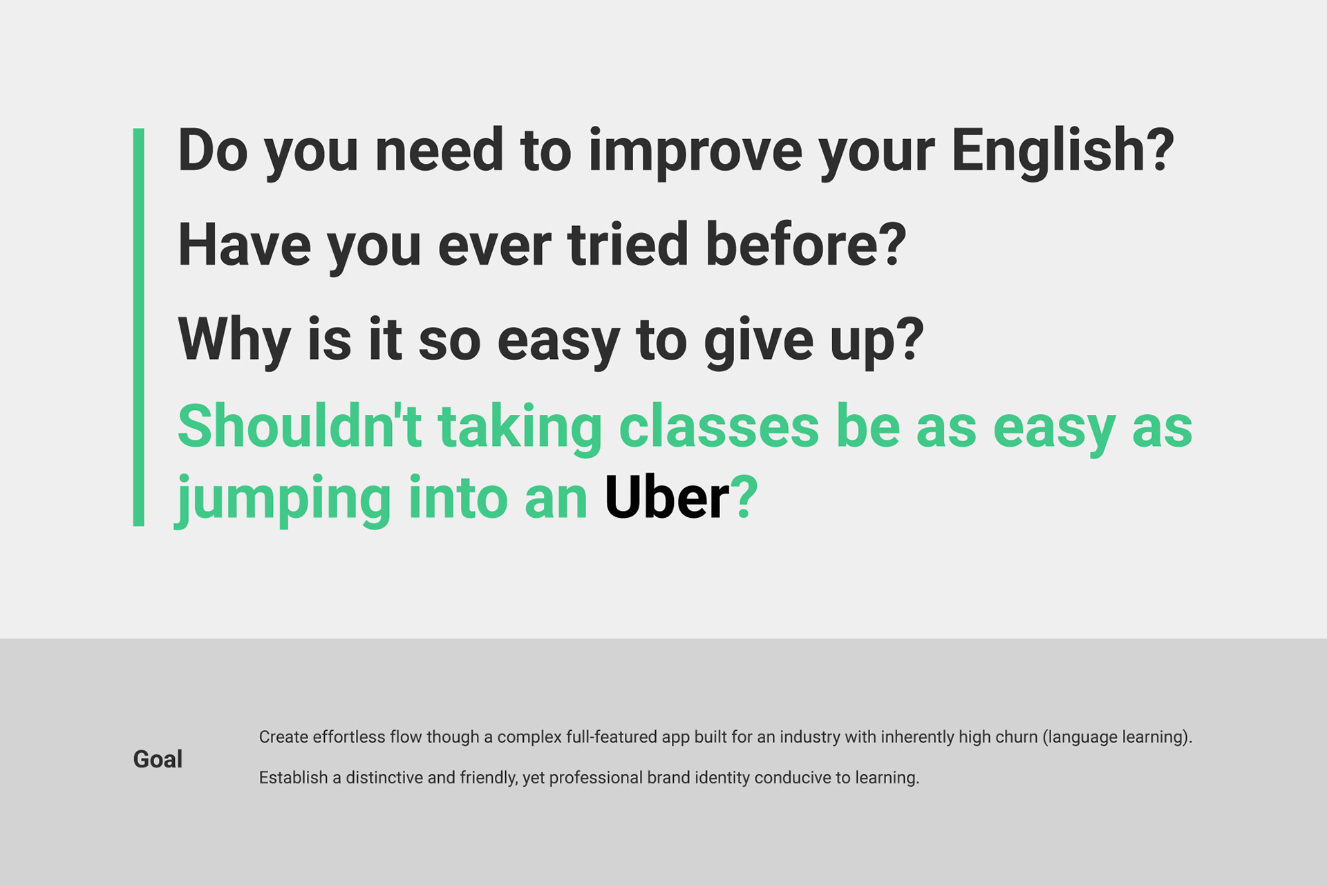
Business Goal
Create effortless flow though a complex full-featured app built for an industry with inherently high churn (language learning).
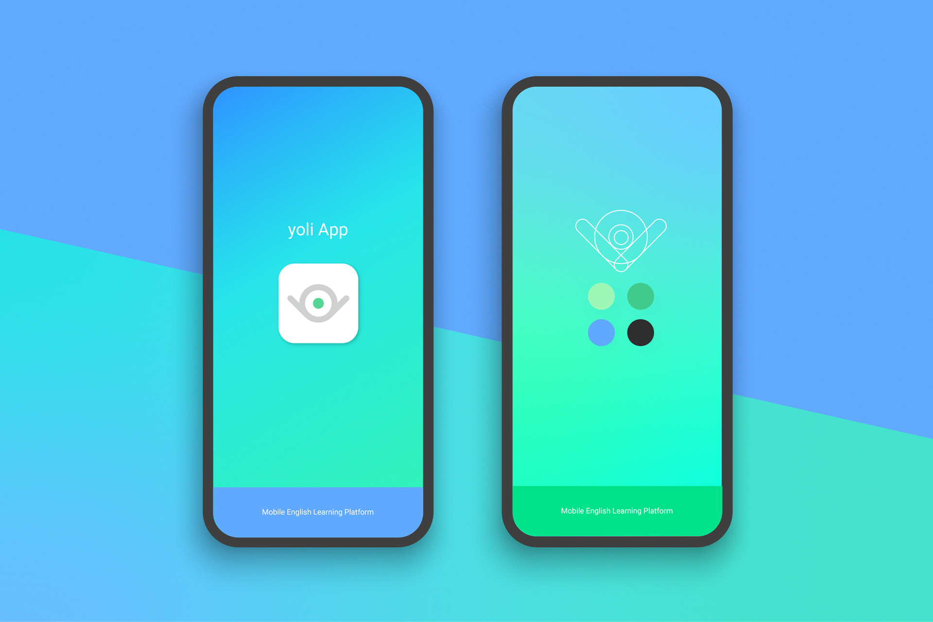
Establish a distinctive and friendly, yet professional brand identity conducive to learning.
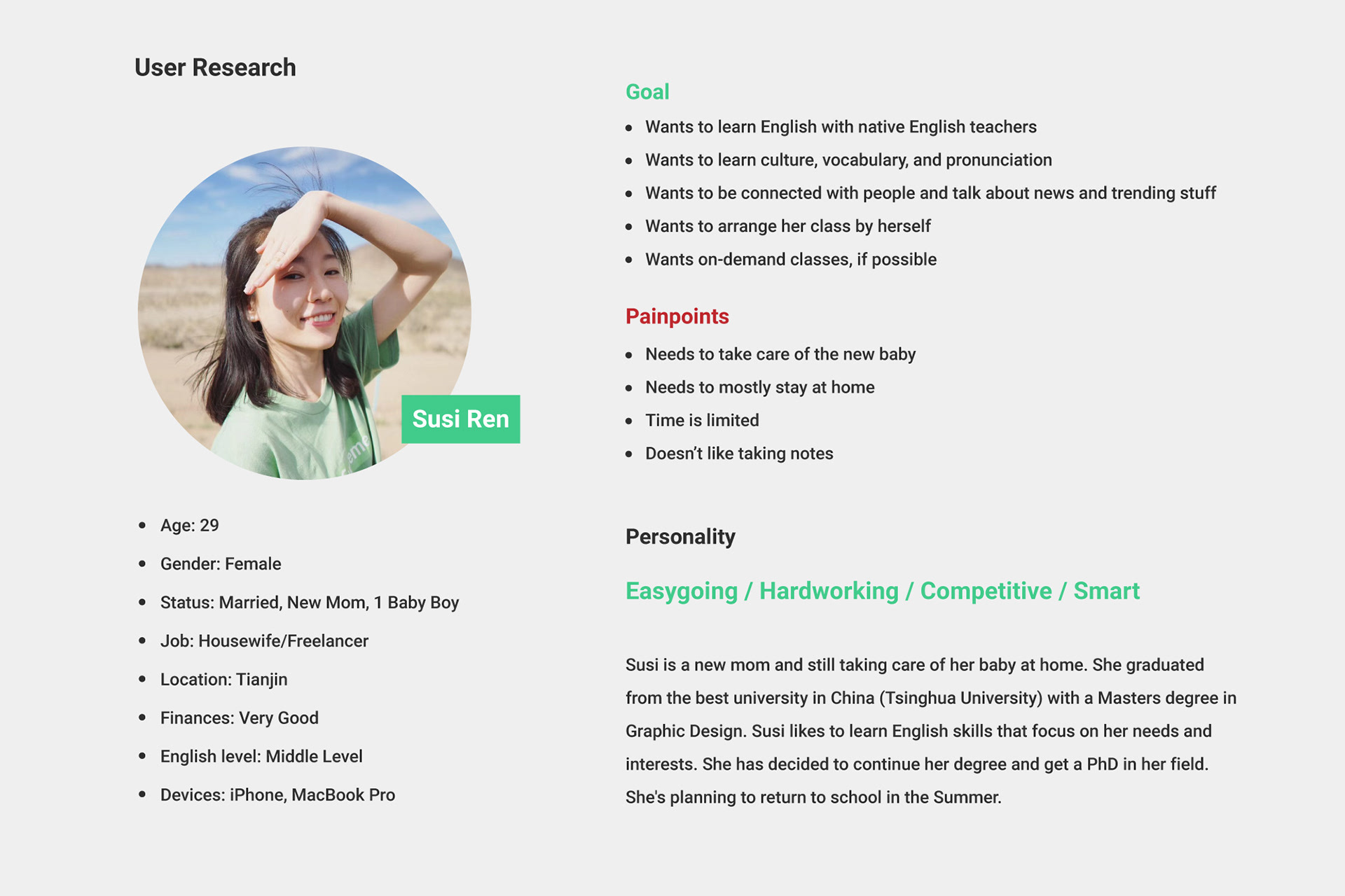
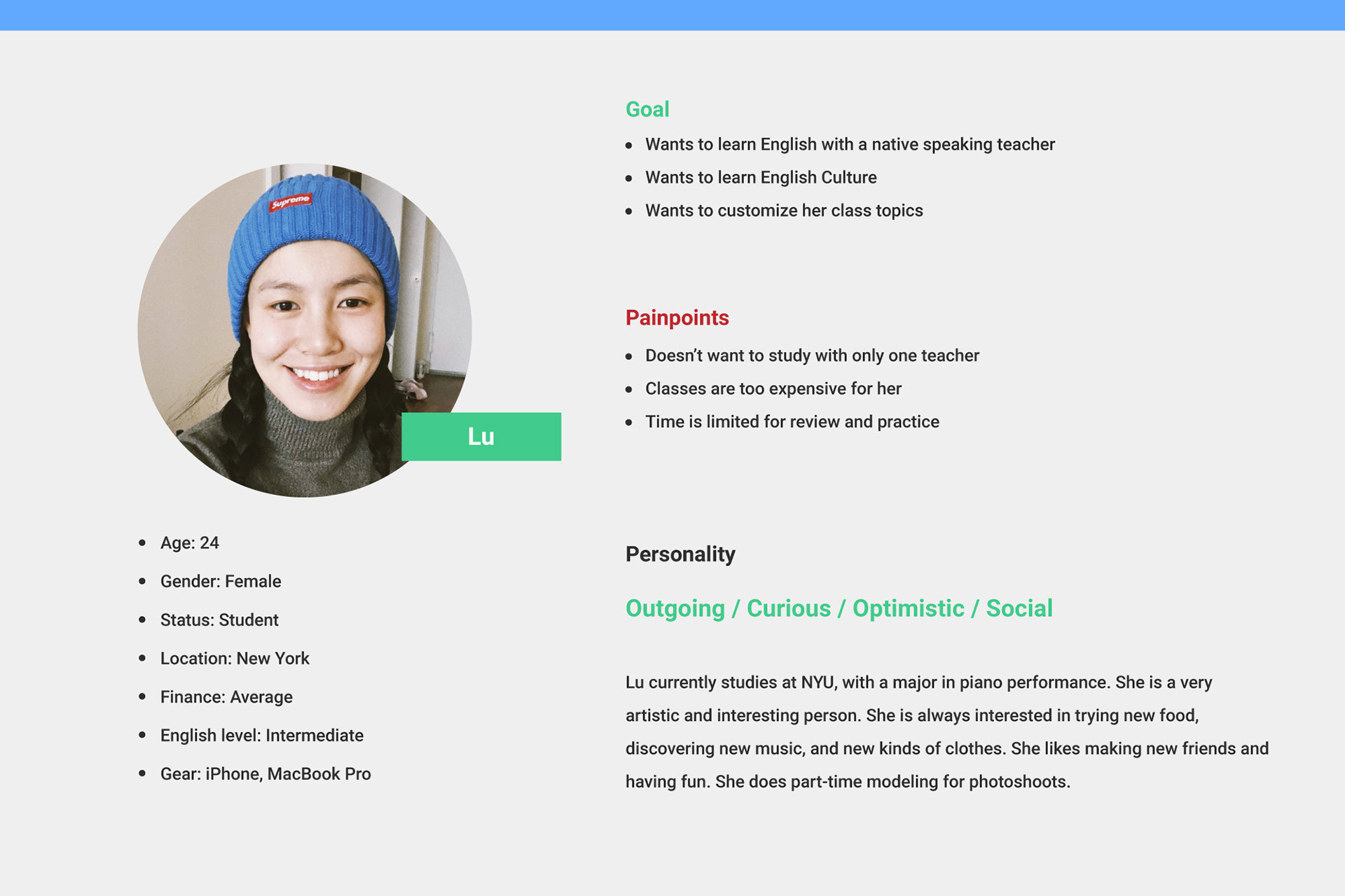
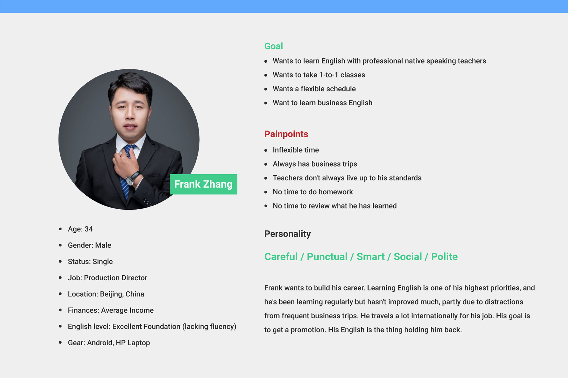
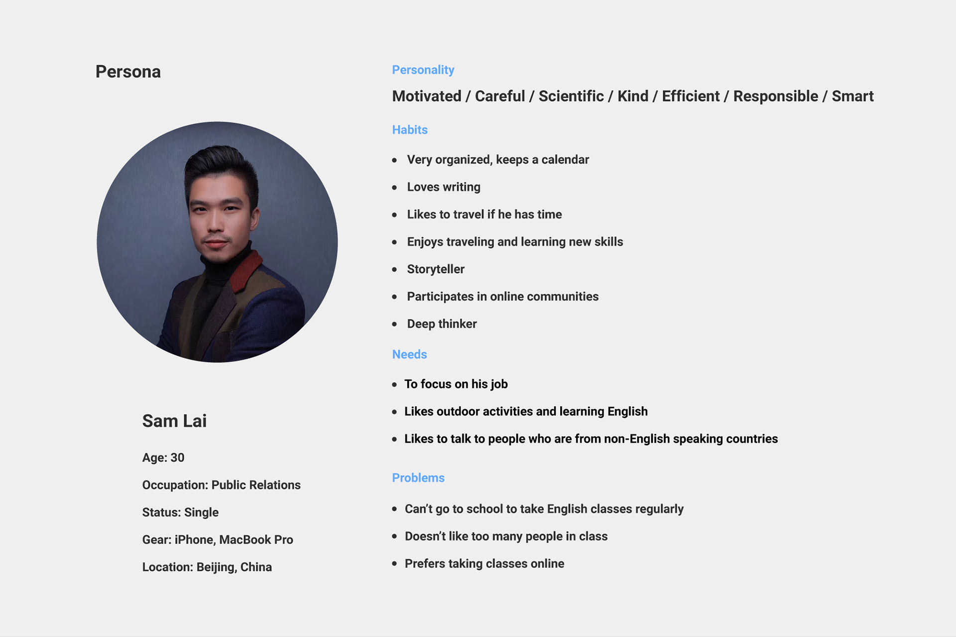
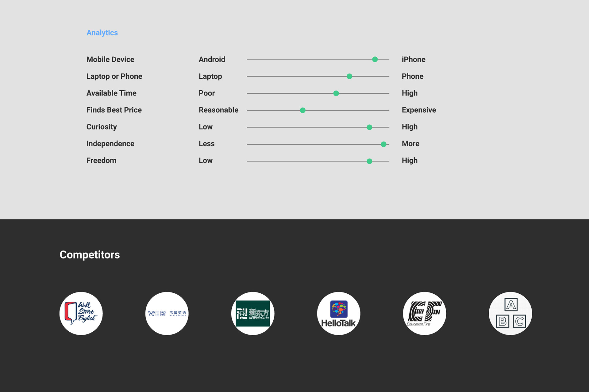
Personas
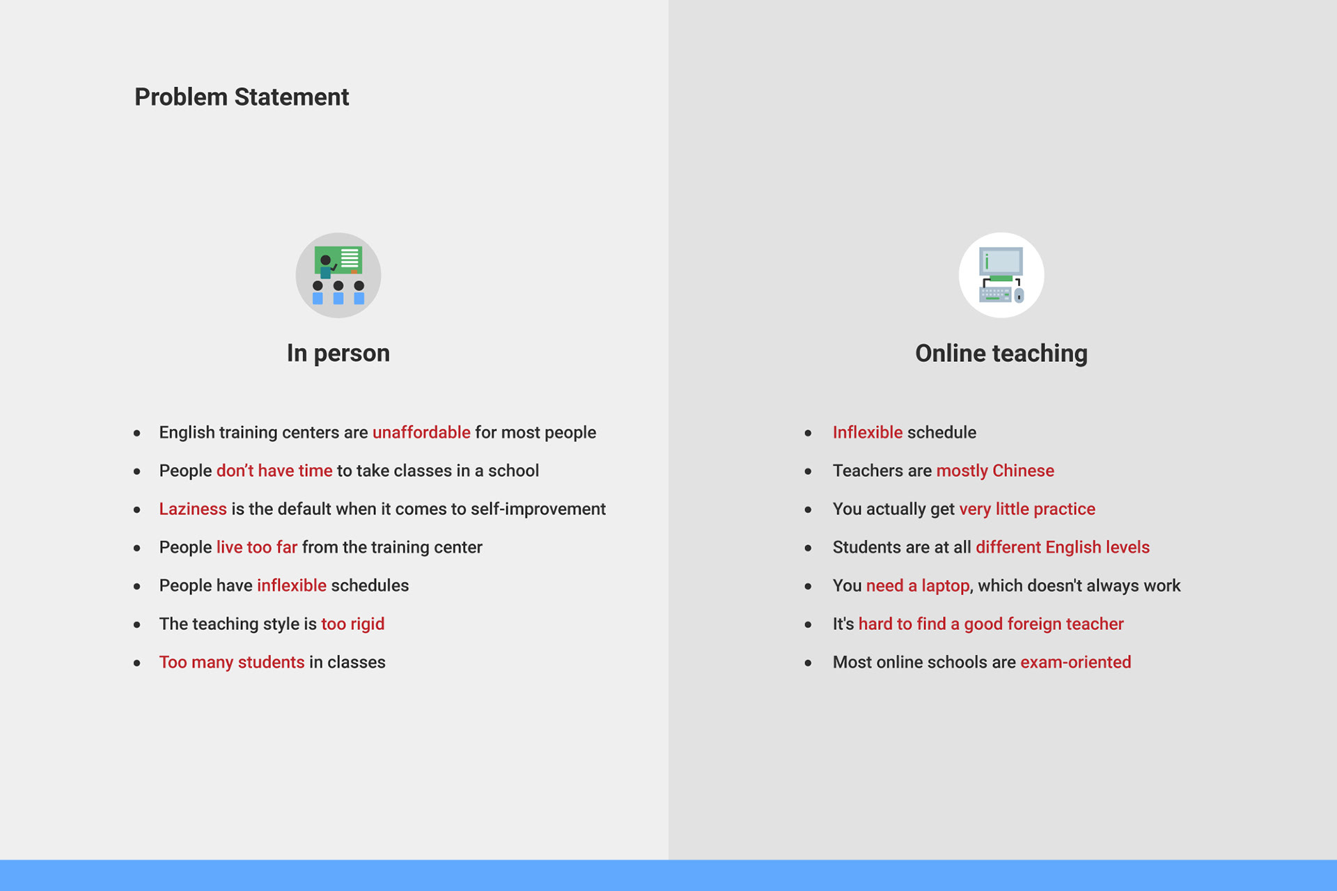
Problem Findings from Interviews
In person:
- English training centers are unaffordable for most people
- People don’t have time to take classes in a school
- Laziness is the default when it comes to self-improvement
- People live too far from the training center
- People have inflexible schedules
- The teaching style is rigid
- Too many students in classes
Online teaching:
- Inflexible schedule
- Teachers are mostly Chinese
- You actually get very little practice
- Students are all different English levels
- You need a laptop, which doesn't always work
- It's hard to find a good foreign teacher
- Most online schools are exam-oriented
Painpoint:
- Doesn’t want to study with only one teacher
- Class are too expensive for her
- Time is limited for review and practice
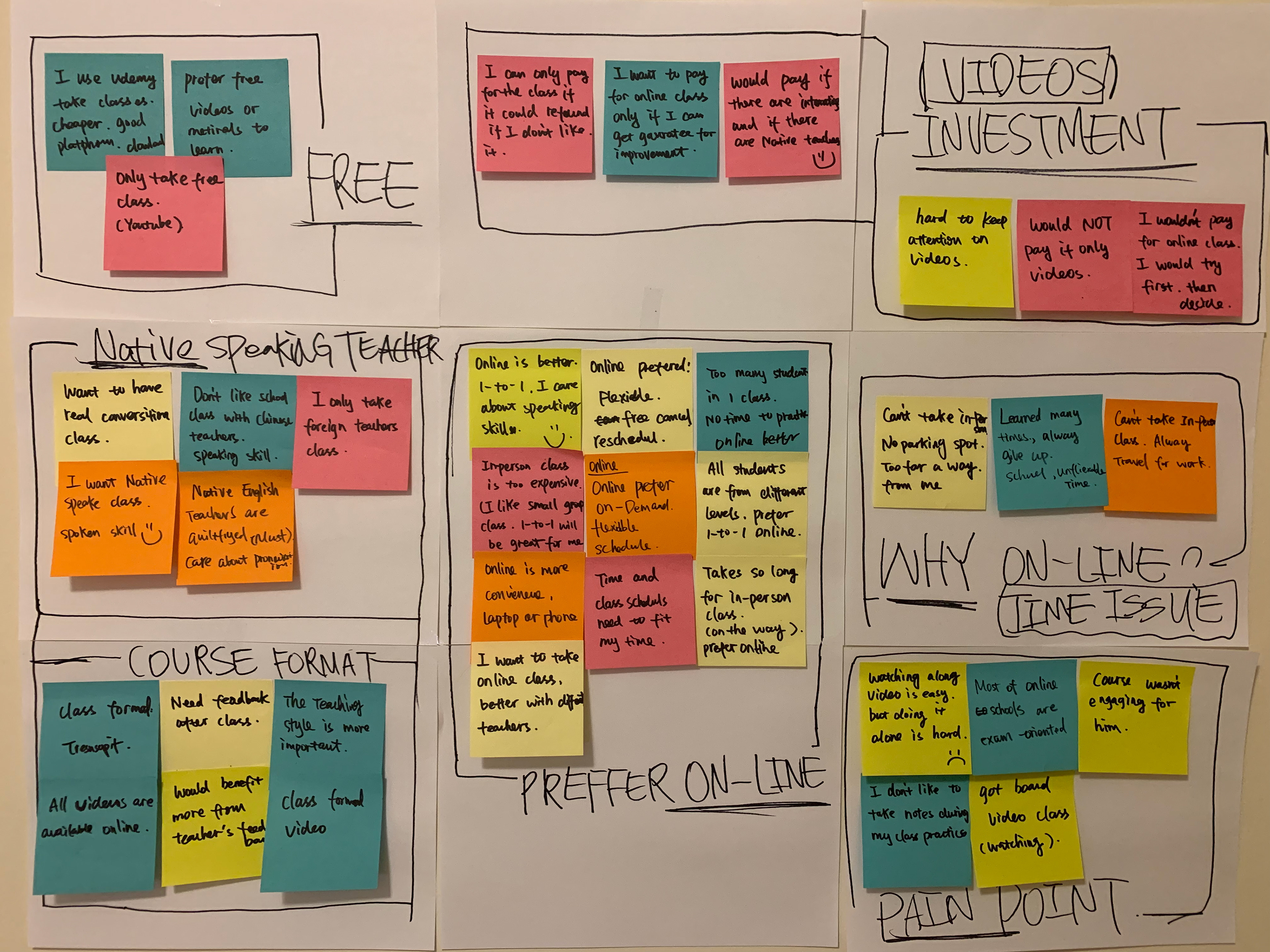
Affinity Mapping
User Goals
1. Users want native speaking teacher
2. Uses take an English class anytime, anywhere
3. Users want course records to review
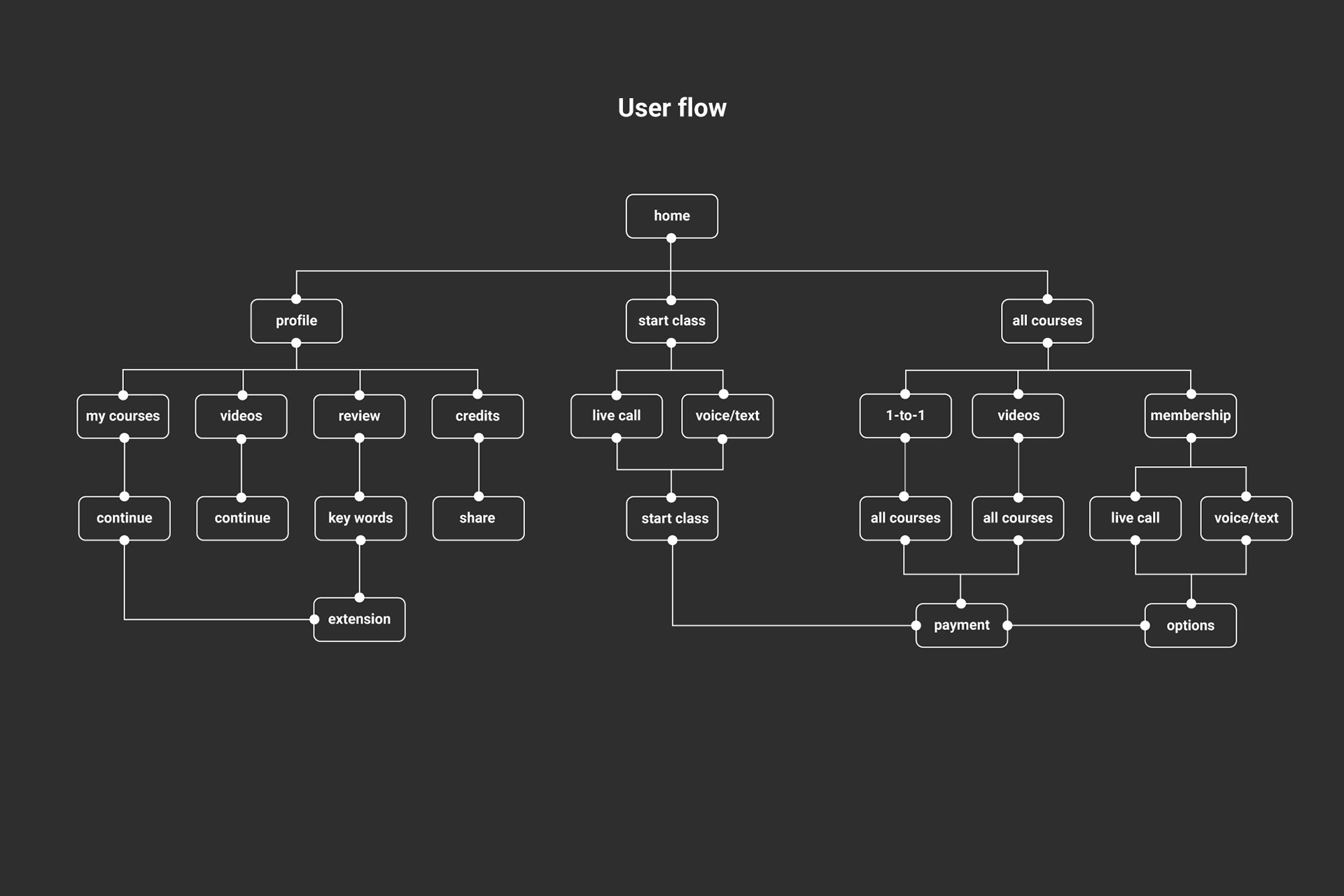
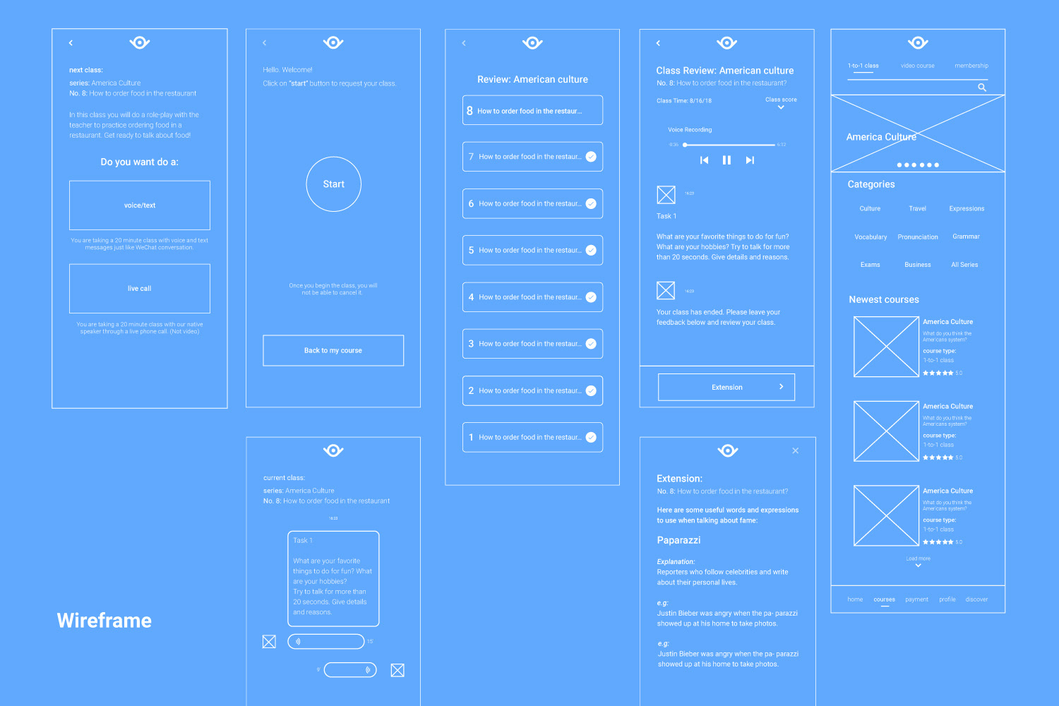
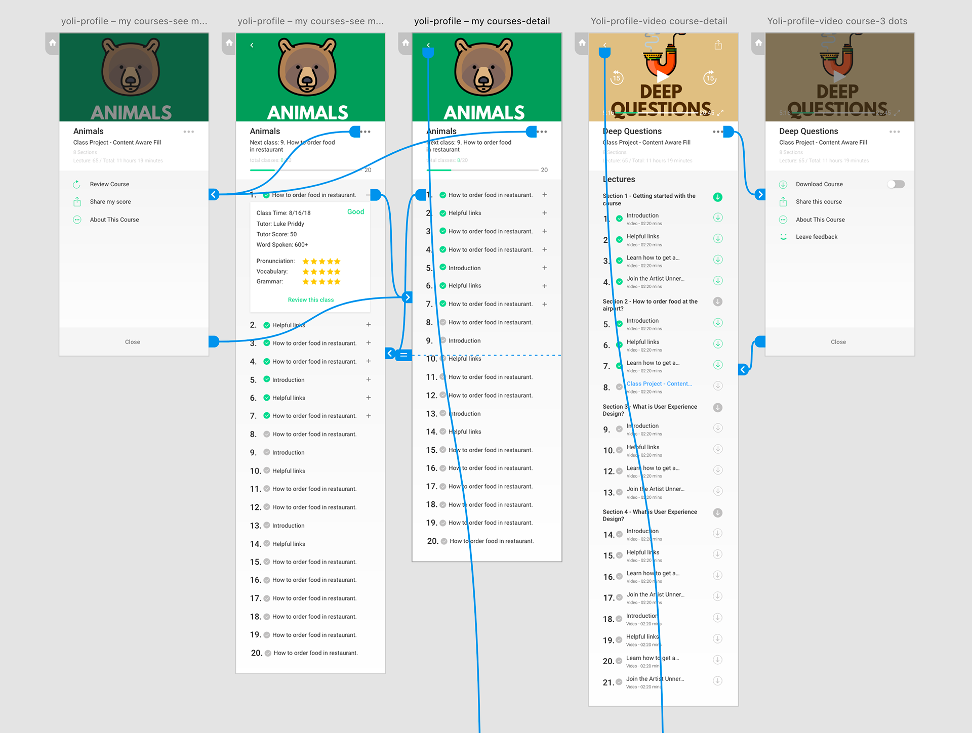
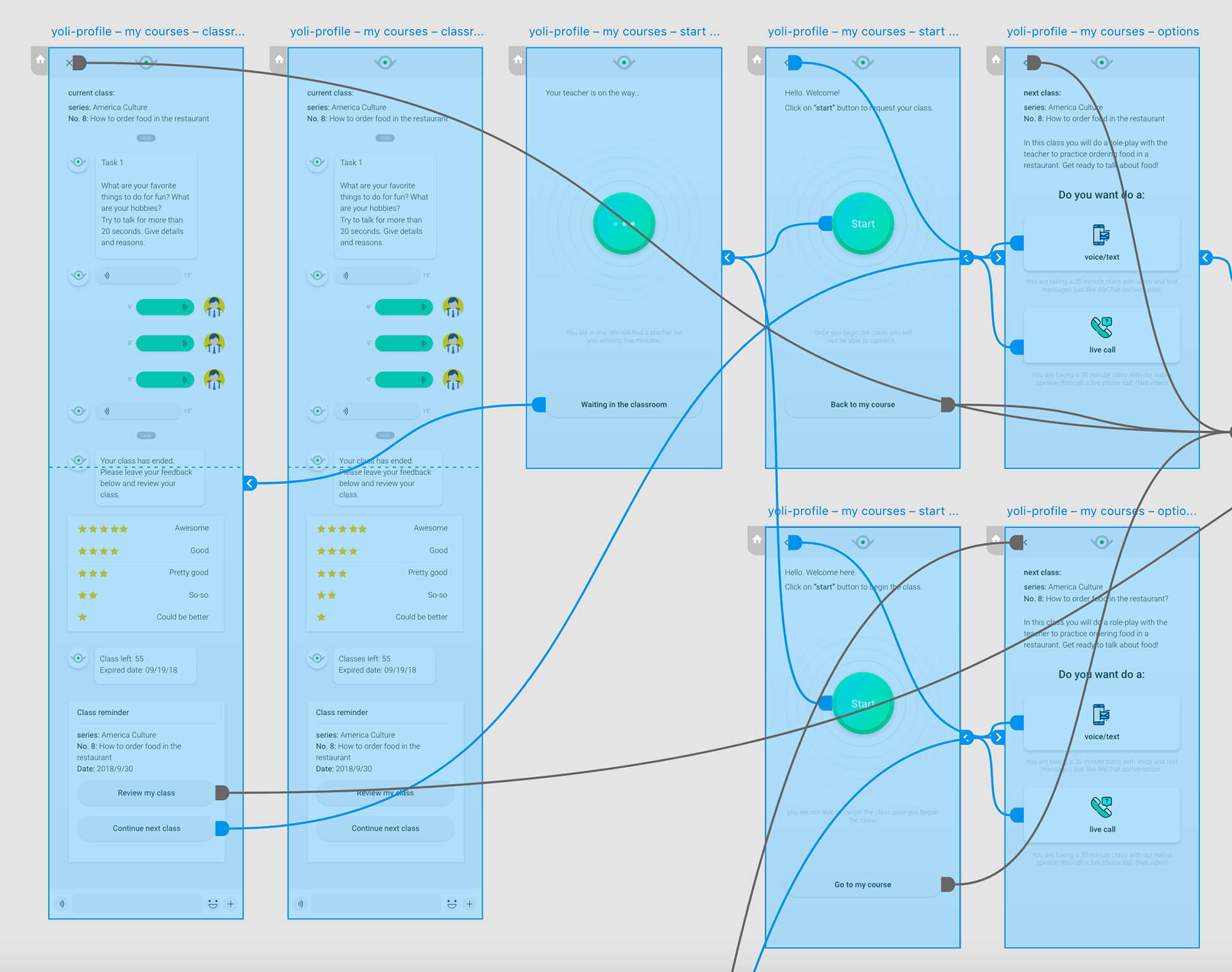
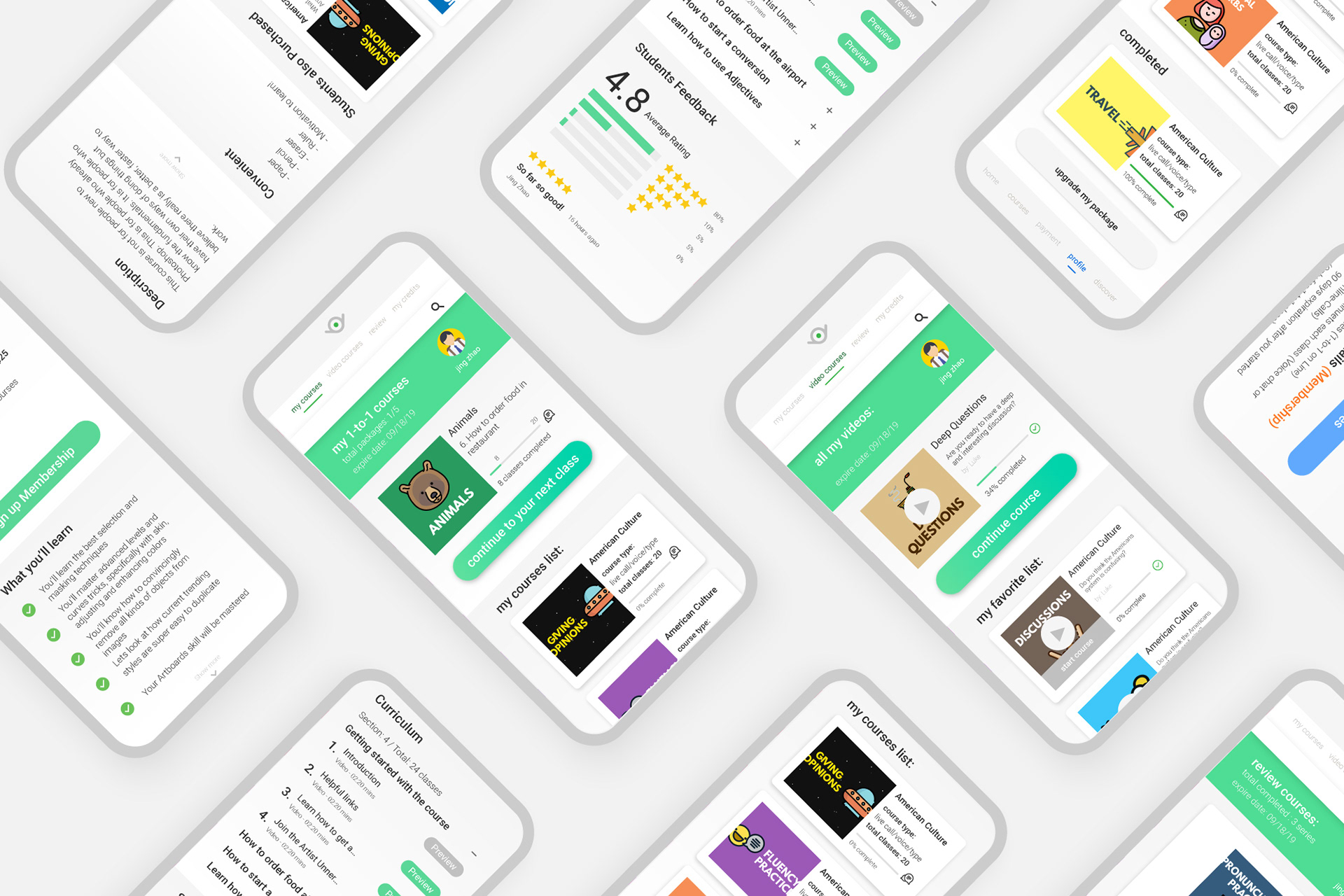
What is the solution?
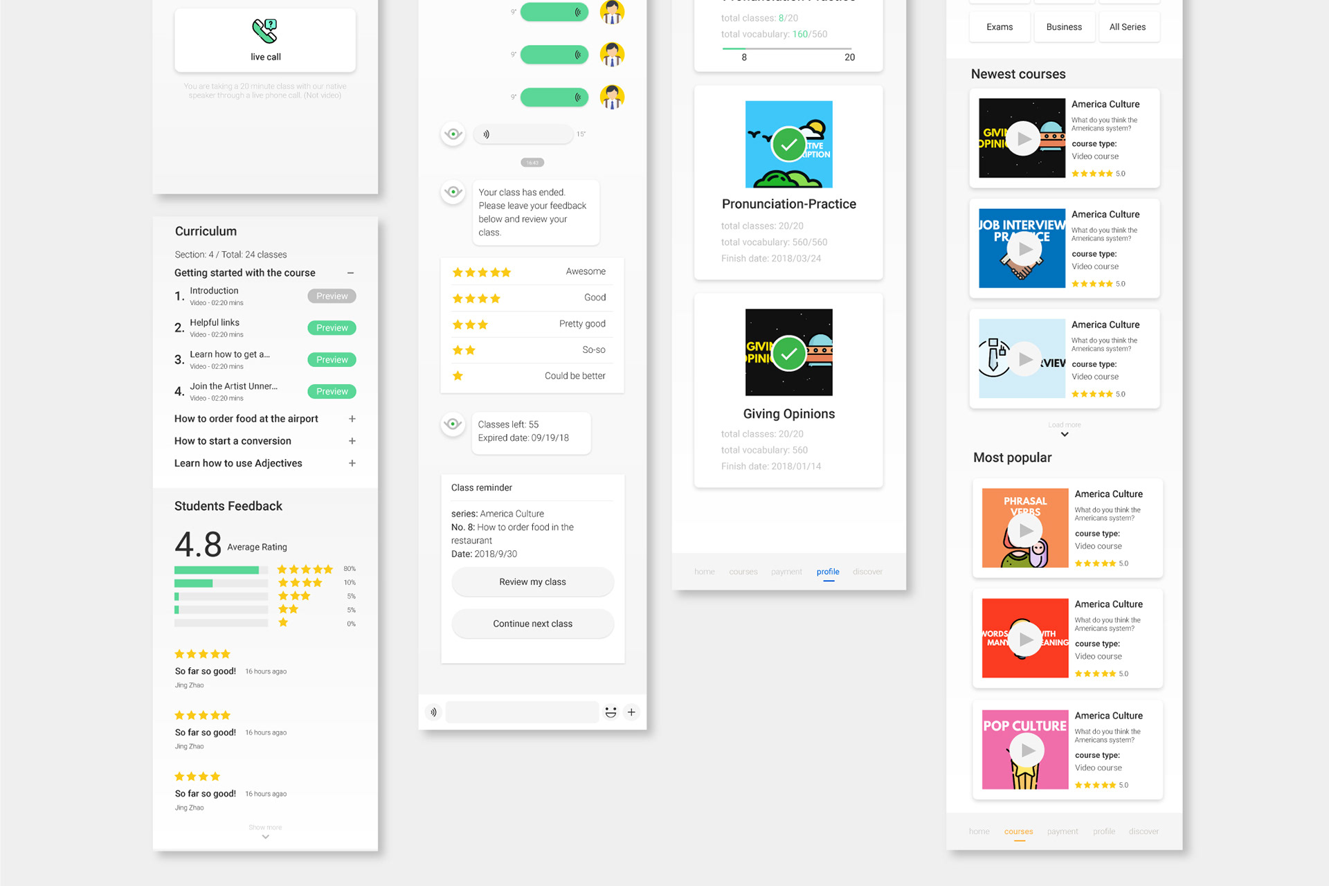
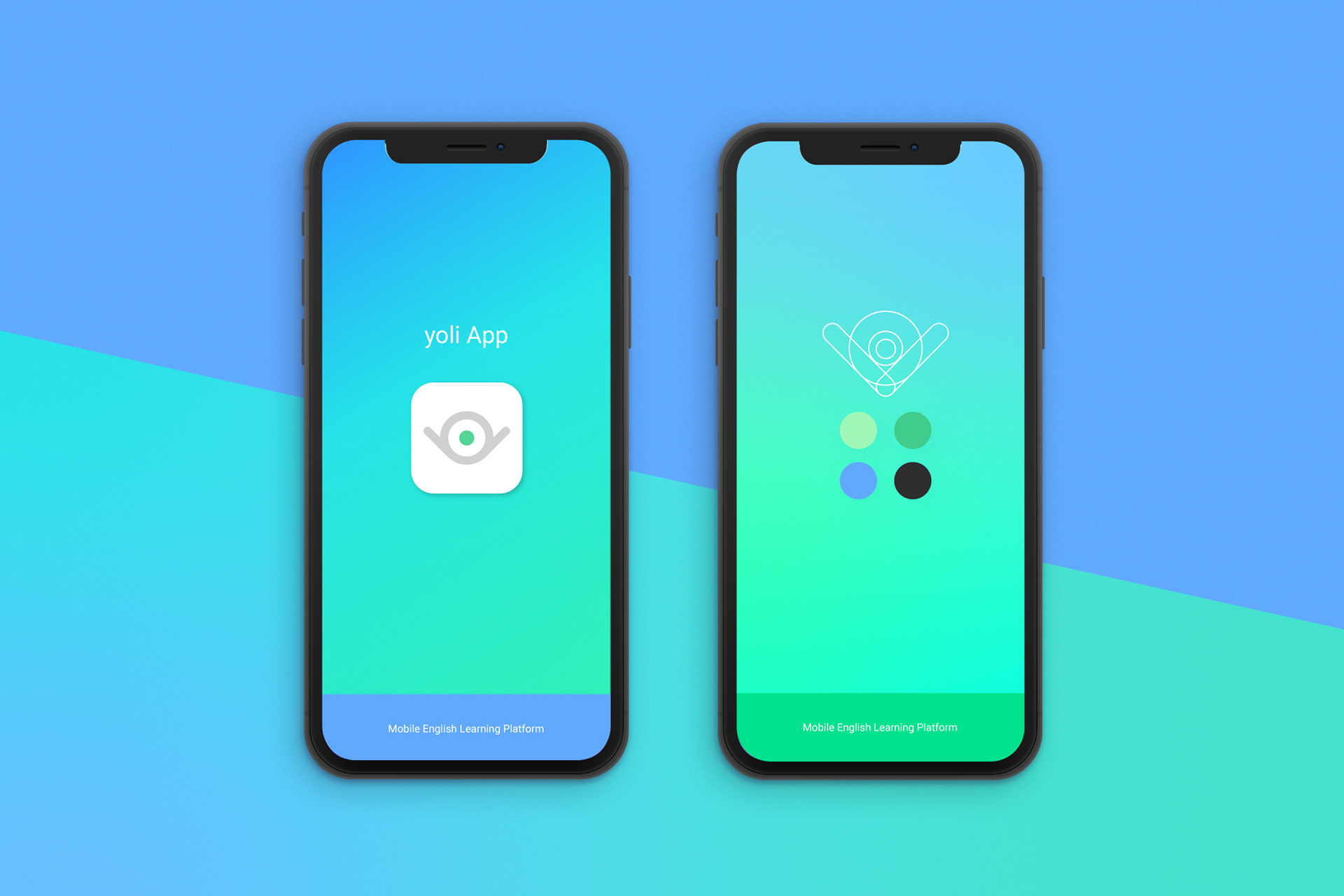
Distinctive clean shapes and strategic use of colors reinforce spaces within the app according to behavior (i.e. passive study, 1-to-1 classes, course selection). These aesthetic cues give learners a clear sense of where they are, and what to do next.
After extensive discussions with the yoli team to deeply understand its core users and challenges with churn, course progress visibility and one-click progression (i.e. start next class) became central to the UI/UX.